
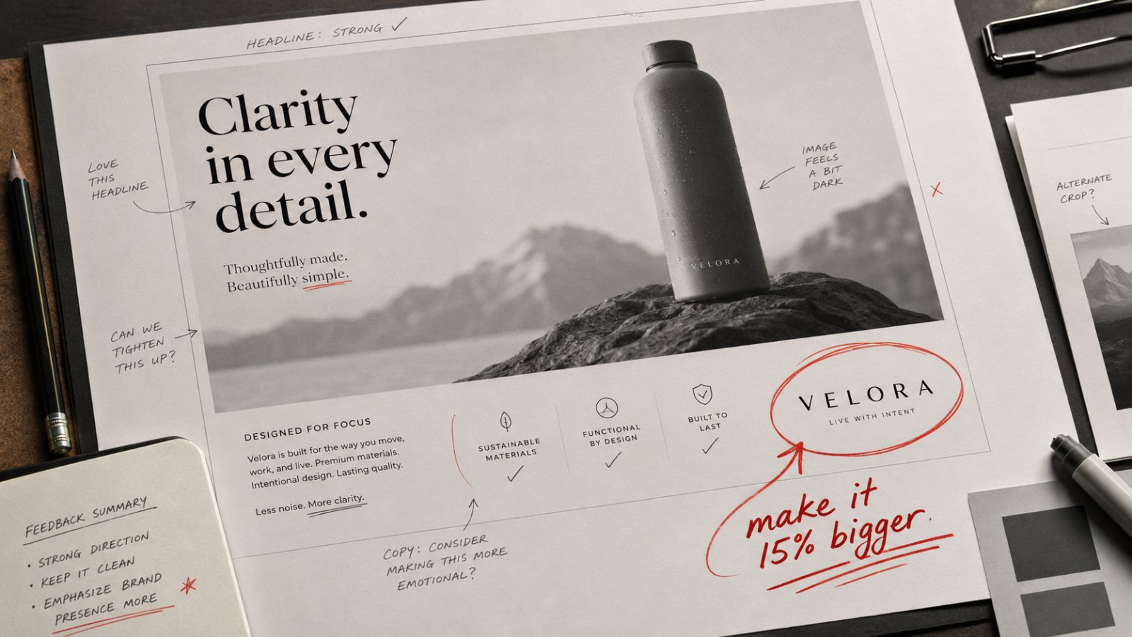
What “Make the Logo Bigger” Really Hides
“Make the logo bigger.”
Possibly one of the most repeated client comments in the business. Agencies rarely welcome it. Compared to changing the strategy, questioning the idea, or asking for a completely new route, it may sound like a small comment. Easy to fix. Easy to dismiss.
That is why it is often misunderstood. Agencies can hear it as a lack of appreciation for craft. Many times, there is something else sitting behind it.
We are investing. We are taking the risk.
That is often what the client is really saying: I cannot afford for people not to know it is us.
That concern deserves more respect than it usually gets. A campaign is judged in market, but it is also judged before it reaches the market. It is judged by the CEO seeing it for the first time, by the CFO asking what the investment is buying, by a regional team comparing it to other markets, and by colleagues who were not part of the process and who will judge it in ten seconds.
In those rooms, subtlety can disappear very quickly. So when a marketing person asks for a bigger logo, the request may have very little to do with design taste. It may be self-protection or boardroom protection, a way of reducing risk before the work is exposed to people who were never part of the journey.
This is where loss aversion becomes useful. People feel a possible loss more sharply than a possible gain. A smaller logo may make the work more elegant, give the idea more space, and make the piece feel more confident. The client may see a different risk.
What if people like the work, but do not remember who it was for? What if the idea travels, but the brand does not? What if the work is praised, but the investment is hard to defend?
That fear is real. It is one reason the logo becomes the safest thing to touch: visible, measurable, controllable.
The wrong question can still point to the right problem.
Maybe the brand does not have enough distinctive assets. Maybe the work looks good, but the brand’s role is weak. Maybe the idea is memorable, but attribution is not. Maybe the agency has not made the client confident enough to defend the work internally.
Or maybe the marketing team knows exactly what will happen in the next meeting, and is trying to protect the idea before someone more senior kills it. That happens more often than agencies like to admit.
Sometimes the bigger logo is for the meeting before the audience ever sees the work.
The mature response is to understand what is really being protected: brand credit, internal confidence, budget accountability, recognition, or trust in the idea.
Once that is clear, the solution may be a bigger logo. Or a stronger brand cue. Or a clearer product role. Or better use of colour. Or a more distinctive ending. Or simply a better explanation of why the work will be recognised.
The size of the logo is usually the visible part.
The better question is whether the brand is strong enough to be recognised without asking the logo to do all the work.
That is a better conversation than arguing over another five percent.
Habib Rihana is the founder of Short Pencils, an independent marcom advisory helping leadership teams, CMOs, founders, boards, and agencies make stronger marketing and communications decisions across the Levant and GCC.